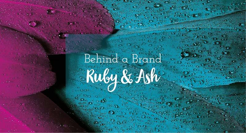
Fran and I worked together recently to revamp her brand Ruby & Ash, giving it a facelift for 2020 and the new decade. Ruby & Ash make funky, fun but functional handbags and accessories using quirky fabric prints for customers who like bright colours and unique pieces.
Her existing brand was a bold vibrant pink using a serif font that had a groovy & (ampersand).
The brief I had to work with was:
- Pinks and plums (to help tie into the existing brand)
- Fun with a touch of class
- Some flourish
- A graphic of some description
‘I need some sort of graphic, I have no idea what though’
- no preference for font style
Fran also wants to be able to use elements from her new logo design as a fabric design in the future.
And the design needed to suit being laser cut onto acrylic plates that she uses as labels on her products. This was a really important piece of information to have upfront as depending on how the design was going to be laser cut would impact on design decisions we had to make.
Fran wasn’t really sure what she wanted. So she asked some friends to describe her in a logo – which was really quite helpful (I liked it so much I might add it as a question in my design brief, thanx Fran), this is what they said:
- Bold
- Wild and crazy but refined
- Bush but beachy
- Quirky and fresh
Design decisions
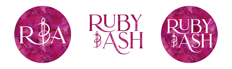
Basically Fran left me with all of the above information to work my magic. I felt the best way to add the flourish we were after was with the ‘and’ element of the logo. Lots of fonts have very groovy ampersand symbols but I felt we needed something a bit more unique so sketched up a page of ideas based on ways to write ‘and’. From typical ampersand based ones to more unique squiggles and even a + in the form of a button. In the end a few of the squiggles made me realise that I could use a sewing needle as part of that element, I was onto a winner. Needle and thread what’s more perfect as a unique element for a business based in sewing?
With font choice I wanted to stick with a serif font (aka the fonts where the letters have feet), to add that touch of class/refined feel that was needed. One with a bit of flourish and fun to like with the groovy & icon I had created. So a more modern take on a traditional typeface.
The end result
A bold pink/plum watercolour finish with the & icon was perfect for what we wanted to create.
‘Fun with a touch of class and flourish’
Moodboard: Beauty Simplicity Calm
Moodboard – Beauty Simplicity Calm Moodboards can be used to help portray the feeling of a...
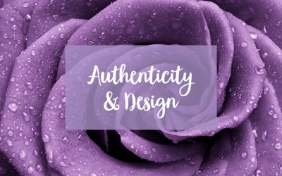
Authenticity & Design
Authentic Design 'Attempts at originality can often feel forced and precious but authenticity has...

Moodboard: Clean Crisp Industrial
Moodboard – Clean Crisp Industrial Moodboards can be used to help portray the feeling of a...