Brand Consistency
What is it?
Brand consistency is using the same design elements for all your business materials. It consists of font choice, colour use and layout (text orientation, logo placement etc). The business materials I’m talking about are business cards, website, social media posts etc. Using the same fonts and colours across all these materials enables them to look cohesive, like they belong together and thus belong to the same brand.
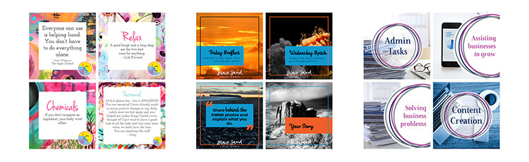
Design elements may be simple from a photo ‘style’ as you can see int the image below. Or more complex with other design elements used within the imagery: for example, text placement or the use of overlays. You may have 2-3 different style of designs that link by your brand colours or the placement of your logo in a consistent position.

The way you write and talk in your business also comes into play with consistency, it’s the voice of your business. Use a consistent language style, be it professional or conversational that suits your business.
Why is brand consistency important?
The overall result of brand consistency is recognition. Being consistent helps people to easily identify content as coming from your business. Being consistent helps your business present a cohesive look to you audience, which makes you look more professional.
If all your social media posts have a similar style, people will recognise them as you before they see/read who posted them.
Visual consistency
Do you see the words or the images first when scrolling on social media? Most people, if not all, will see the images first and decide from that if they will look further at the post, article or advert.
This is important as there is so much visual content out there if you clients/customers are scrolling through social media at a quick glance they will know it is you, and if you always provide valuable content they will stop and read the post.
That is why brand consistency as a whole is so important in the day and age of social media. You want your business to be recognised as you. As in these three examples from Jess Crawford, Black Sand Social Media and Bowerbird Solutions show visuals do impact on how a brand is seen.
How can I get it?
To be consistent with your branding it helps if you have a style guide for your brand. This is a simple document that lists the fonts and colours used within your branding. It may also discuss logo placement or when to use alternate logos that your designer may have created.
This basically becomes your brand bible, everything you create for you business you tie back to the style guide.
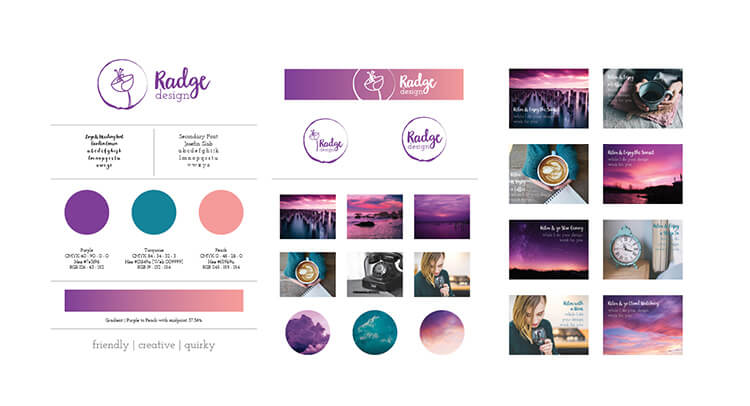
Use the same fonts in everything, I know it is tempting now and again to throw in an odd one but it really doesn’t help your brand in the long run. If you don’t have access to the fonts your designer has used in your logo, ask them for an alternative that they suggest will be complementary to your existing branding. The same goes for colour use – try and stick to 2-3 colours or at the most 4 and use one or more in all the branding materials you create. The more often you use the same colours and fonts the easier it will be for your customers to recognise your posts as you.
So that in a nutshell is Brand Consistency and how to get it.
Need a little help with consistency for your social posts, I can help with a Designer Socials package or with the Designer Social templates (if there is an option that suits your brand, more will be added periodically).

Moodboard: Clean Crisp Industrial
Moodboard – Clean Crisp Industrial Moodboards can be used to help portray the feeling of a...
Mistakes & Design
We all make mistakes, it’s a natural part of life. It’s what we do after them, and what we learn...
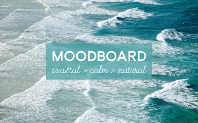
Moodboard: Coastal Calm Natural
Moodboard – Coastal Calm Natural Moodboards can be used to help portray the feeling of a business,...