
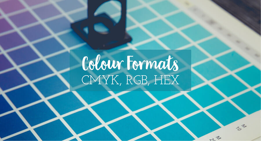
CMYK, RGB, HEX and Pantone are all different ways to define colour. But they also all have different uses so it is important to understand the difference between them.
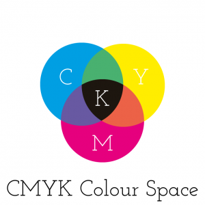
CMYK is for Print
It is a subtractive colour mode, white (the base) has no colour so the addition of colours will result in a new colour and when they are all combined the final colour is black. CMYK stands for cyan, magenta, yellow and key (black). It is a bit like your old school colour mixing at school where blue and yellow make green but mis them all together and it gets rather murky.
They are not as bright as RGB colours, as paper absorbs colour.
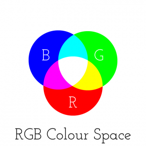
RGB is for Screen
It is an additive colour format, RGB gives brighter colours and the light from the screen on which they are displayed can add to this. Any design that is created for screen use should be saved in RGB format, some colours when saved from CMYK to RGB format will look fluro.
HEX Codes
Are numbers that give a colour in the RGB colour space. The letters and numbers enable to representation of 256 colours using pairs of letter/number combinations rather than using 3 digits for each resulting in a 9-digit long colour code. In a HEX code the first pair relate to red; the second to green; and the third to blue. So for example #000000 equals black, while #FFFFFF equals white, #FF0000 is Red, #00FF00 is Green, #0000FF is Blue. HEX codes are handy for lots of web applications as you can generally paste in your HEX code and get the right colour rather than manually attempting to select a colour.

Pantone
Is called a ‘spot’ or flat colour, they are from a system known as the Pantone Matching System (PMS). These are propriety colour blends of specific pigments. To match the colours you need to have access to Pantone swatch books. Printing with Pantone colours is more expensive than using CMYK, however using PMS is the most reliable way to ensure you get the exact colour in your printed materials.
And that is a brief overview of the different colour formats you may hear about when talking with a graphic designer. It is important to note that all screens can affect how colours look, so when looking at a design on different screens or even your phone the colours can appear different. And every printer will result in slightly different colours unless you have used Pantone ‘spot’ colours.
Bibliography: D Dabner, S Calvert & A Casey (2010) Graphic Design School – a foundation course for graphic designers working in print, moving image and digital media, 4th Ed.
So, What’s a Logo?
So, what’s a logo? A logo is a visual representation of your business, it could be a wordmark or...

15 Quotes about Being You
What does it meant to be you? Are you honest with yourself or hiding behind what you think you...

Moodboard: Nostalgic Glamour
Moodboard – Nostalgic Glamour Moodboards can be used to help portray the feeling of a business,...